Poster Picks: Film Versus Marketing with Blade Runner
Examining this iconic poster from an equally iconic film.

Blade Runner is a 1982 science fiction film about a cop who must chase down humanoid androids hiding in Los Angeles, all the while questioning the morality of what it all means.

In the sci-fi genre, few films have had the reach and influence that Blade Runner has. Based on a short story called Do Androids Dream of Electric Sheep by Philip K. Dick and brought to the screen by writers Hampton Fancher and David Peoples and director Ridley Scott, the neo-noir dystopian Los Angeles of the very near future serves as a living breathing backdrop for a myriad of well-developed and beautifully presented characters that populate an age-old story about what defines us. Ostensibly a sci-fi action thriller, the film is rich with deeper themes and serves as a touchstone for philosophical debates on morality, feminism, scientific responsibility, and the questionable role of a hero. Misunderstood and panned at the time of release, the film is now considered one of the greatest movies ever made, with its production design and atmosphere often singled out as some of the most groundbreaking in the industry. The critical pendulum has swung fully in the other direction.
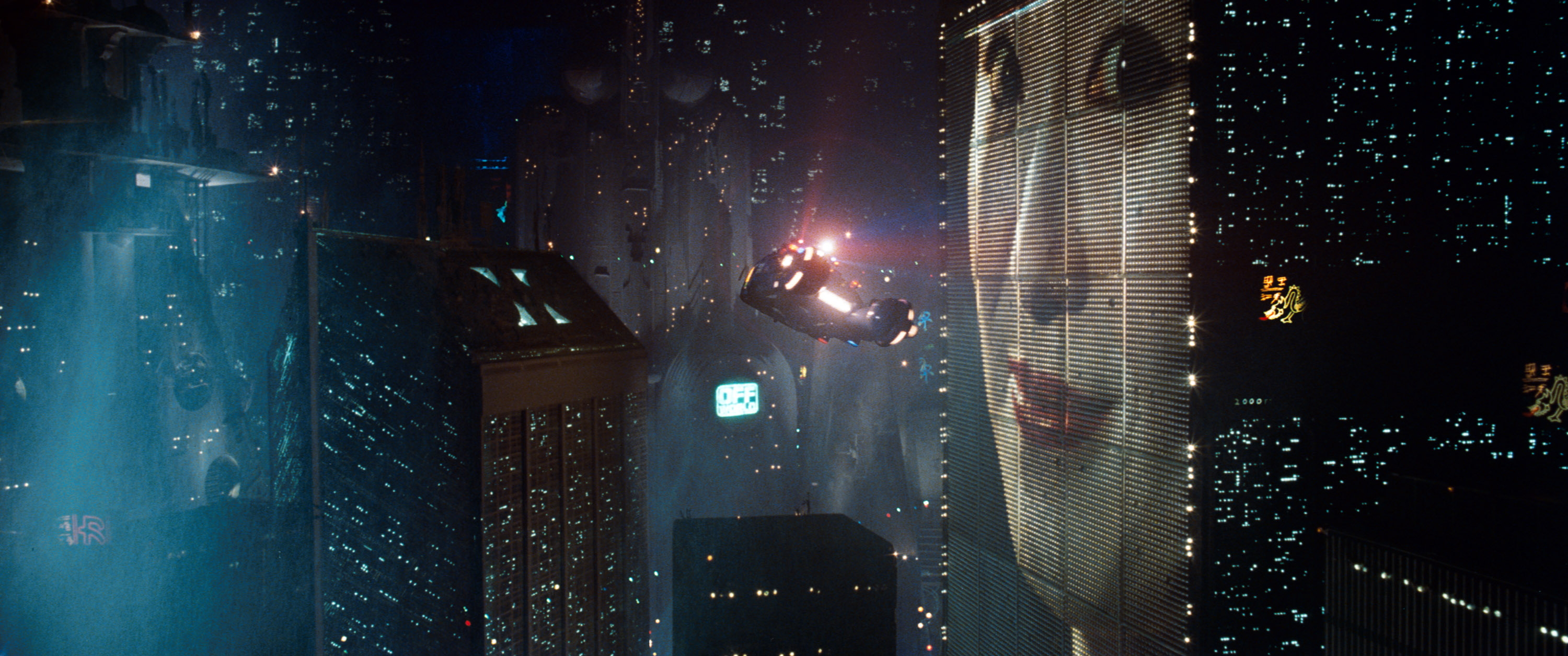
The look of the film is crucial to its success, creating a vision of the future that is both recognizable and yet highly imaginative. Looming skyscrapers dotted with light, some featuring full sided video imagery and product placement create deep foggy glass-framed canyons filled by flying vehicles (called Spinners). The streets are blotted with a cacophony of noise, vendors, bikes, and people suppressed by heavy architecture, humming neon lights and oppressive gloom. The roadways are strewn with papers and trash while the masses bustle about in great droves. In the alleys and side streets, small packs of looters and gangs (children sometimes) comb the corners and parked cars for treasures.

Ridley Scott has long given credit to Edward Hopper‘s classic “Nighthawks” as inspiration for the film’s thematic design. The dark and near sinister feel of the work draws an obvious connection to Blade Runner, especially in the lighting and mood. For the film, Scott first approached Moebius, an artist known for his work in Métal Hurlant (“Heavy Metal”), a French science fiction graphic arts/comic magazine. Moebius declined the offer but later regretted his choice once the film was released. Instead, the job went to illustrator Syd Mead, who also drew inspiration from HEAVY METAL, creating concept art of a dark, voyeuristic, rain-soaked city cast in deep black shadows and brilliant washes of color.

The story of the film centers on a Blade Runner name Rick Deckard who is member of the police department assigned to track down Replicants, bioengineered humanoid beings who are not allowed to be on Earth. They live “off world” as workers, in combat, or as “pleasure models” providing sexual service. Four of them have returned to Earth (actually five but one didn’t survive) to request they be given more life beyond the 4 years they are programmed with, though that doesn’t quite go as planned. Deckard is told to “retire” the Replicants, so he hunts them down, one-by-one, eventually falling in love with another Replicant who works for the company that produces the beings but doesn’t know that she is in fact not a human. And perhaps, this exactly the same dilemma Deckard must face for himself.
The marketing for Blade Runner began with the original theatrical poster, which features the two main characters and an aerial view of the police headquarters with a Spinner car circling above. Here is the one sheet minus the copy.
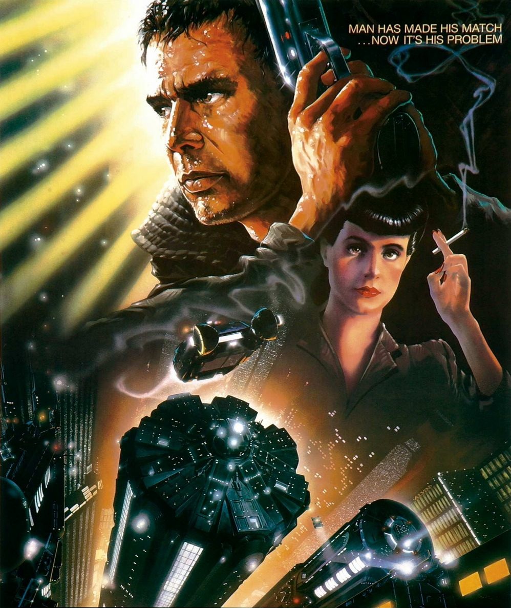
The painting is by John Alvin (1948-2008) an American illustrator with more than 135 film posters to his credit. His first was for Mel Brooks’ Blazing Saddles (1974) and he would go to create some of the most famous and beloved film art ever produced. So identifiable, within the industry a new style emerged regarded as Alvinesque. Here’s a sample:

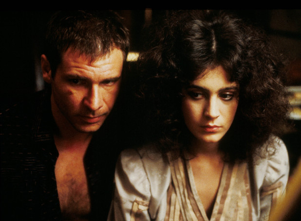
The Blade Runner print is a heavily stylized rendering of real events in the story, which I have found and taken screen shots to better compare. First is Rick Deckard. Played by Harrison Ford, the poster version is not quite an accurate portrait of the actor and is perhaps more familiar as Ford simply by years of association with the image. Gripping the fictional LAPD 2019 blaster in a defensive position, the painted character is rimmed with sweat and framed by a yellow light reaching out from his around his face. The inspiration for the shot comes at the 1:31:13 mark and is much different than what is shown on the one sheet. The image is reversed and Deckard is in a dark hallway in The Bradbury Hotel as he chases down the last two Replicants.

Next is Rachael. Portrayed in the film by Sean Young, the most noticeable thing in both the poster and the film are the eyes. As she is a Replicant, the eyes have an odd reflective capacity in the right light. Not as prominent in the poster, the gaze is still locked on the viewer with the same intoxicating hold. In the film she is undergoing the Voight-Kampf test, a methodical interrogation designed to discover whether the subject is human or Replicant. As she is unaware that she is an android, the test is particularly troublesome for Deckard, who is administering the exam. The scene works as well as it does because of Young’s rapturous performance as a machine who believes it is human. The poster captures this wonder as well. Perhaps the most striking element of Rachael in these shots is the smoldering cigarette and the exquisite folds of her fingers. It speaks volumes about her control, curiosity and underlying fear. In the poster, the thin line of smoke spirals lazily up to the tagline: MAN HAS MADE HIS MATCH . . . NOW IT’S HIS PROBLEM. Without seeing the movie, one could easily connect the ambiguous words to the two characters on the poster. Once again, as with Deckard, the painted image is in reverse of the film. This was probably a compositional decision but is interesting as it makes both leads left-handed on the poster. The image is captured from the 00:21:21 mark in the film.

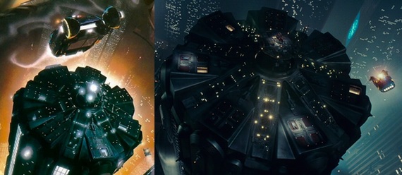
Finally, there is the city. On the poster, the police headquarters is practically glowing in fiery orange as a Spinner police car races up toward the viewer, leaving a magnificent trail of exhaust in its wake, which does two things: serves as a highlight for the wrinkles on Deckard’s jacket and as a visual trail up and into the smoke from Rachael’s cigarette. Looking at the building, it is a bit different than the actual model used in the film, most noticeably the lighting. The approaching Spinner is also much larger and offers greater detail, though the angle of the car in the poster and the car’s inherit design make knowing what it is a bit difficult, but the swooshing trail of smoke provides a much needed frame of references for what we are seeing. The screenshot is from the 00:10:50 mark.
As a work of art and a piece of marketing, Alvin’s poster succeeds with it’s excellent use of space and color and the imagination it invokes. Look carefully how the yellow rays of light in the upper left corner streak down and left while contrastingly, a complimentary orange rises up from the opposite position, the lighted bands of the surrounding buildings echoing the yellow rays above. Separating these two streaks of color is a vivid swath of black that casts the remainder of the subjects in ebony shadow. The symmetry is designed so that our eyes begin on Deckard’s face and then circle left and around up to Rachael and then to the tagline. The mise-en-scène is wonderfully executed and paints a story that hints about much of what we will see and glean from the movie. For example, the glow about Deckard and the streaks of light emanating from around him suggest a godlike figure, heroic to be sure. His eyes are aligned perfectly with the streams and we might infer that he can see and know all, which is precisely what he does in the film, searching and discovering everything about his prey and much, much more about himself. His expression is not sympathetic, nor is it strictly malevolent, but the careful placement of his weapon suggests a pause in his judgement or at least a conscious choice to examine before firing. Compare that with any other action hero on a one sheet who’s gun is always pointed and often even firing. With Rachael, we have even more hints to unfold. The deep inky shadow she is nearly swallowed into is entirely opposite of Deckard. She is a Replicant with no power and no history. Her near emotionless expression is like a mask, which is truly what the woman wears, at least metaphorically (and perhaps realistically as she is not human). She is the tabula rasa, or blank slate, given memories of someone else and there is just the hint of sadness in the eyes of that knowledge. An in-progress black and white rendering reveals that the lower half of the poster was planned differently, concentrating on the angular design of the city.
READ MORE: A closer look at a classic moment in Blade Runner
Overall, the original theatrical poster serves as a classic example of movie marketing, a kind of lost art now that attempts to give a sense of weight to the story instead of the actors in it. The movie has had numerous iterations over the years, with Blade Runner: The Final Cut being, for me, the best of the releases.